Data Analysts Automating Reporting Dashboards with Vibe Coding Tools
 Aug, 29 2026
Imagine building a complex sales dashboard in four hours instead of three weeks. That’s not a fantasy; it’s the new reality for Data Analysts using vibe coding tools. These platforms let you describe what you want in plain English, and AI builds the code, interface, and database connections for you. No more waiting on IT tickets or wrestling with SQL queries for simple visualizations.
What Is Vibe Coding and Why Should You Care?
Vibe coding is a style of programming where natural language prompts drive the creation of functional applications. Google Cloud defines it as a method that uses conversational AI to assist the coding process. For data analysts, this means you don’t need to be a full-stack developer to build enterprise-grade reporting dashboards. You just need to know how to articulate your data needs clearly.
This shift happened fast. In late 2023, tools like Cursor introduced features that could generate entire applications from a single prompt. By Q4 2025, Zapier reported that 68% of data analysts at mid-sized companies now use at least one vibe coding tool. The appeal is obvious: speed. Traditional development cycles often stretch over weeks. With these tools, you can iterate designs and launch operational dashboards in hours.
The Top Tools for Dashboard Automation
Not all vibe coding tools are created equal. Some excel at turning spreadsheets into visuals, while others handle heavy database relationships. Here’s how the major players stack up for dashboard work.
| Tool | Best For | Learning Curve | Starting Price | Key Limitation |
|---|---|---|---|---|
| Glide | Spreadsheet-to-dashboard conversion | Low (2-4 hours) | $15/month | Limited customization beyond basic visuals |
| Bubble | Complex database relationships | Moderate (15-20 hours) | $29/month | Performance issues at scale (>50k records) |
| Cursor | Code-heavy integrations & debugging | High (Requires coding basics) | $20/month | Less intuitive for non-developers |
| Anything | Pixel-perfect UI & security compliance | Moderate | $25/month | Newer ecosystem, smaller community |
| Base44 | Real-time data with Supabase backend | Moderate | $30/month | Dependent on Supabase architecture |
Glide dominates the spreadsheet niche. If your data lives in Google Sheets, Glide transforms static tables into interactive layers almost instantly. Femaleswitch reports an 89% success rate for users converting sheets without any coding knowledge. However, if you try to push complex SQL transformations through Glide, you’ll hit a wall quickly.
Bubble takes a different approach. It uses a visual programming language with a built-in database. This makes it ideal for apps where data entities have complex relationships-think customer orders linked to inventory and shipping logs. But beware: analysts report needing 8-10 hours of training before becoming productive, and performance can degrade when record counts exceed 50,000.
How to Build Your First Automated Dashboard
You don’t need to learn a new syntax. You need to learn how to prompt effectively. Here’s a step-by-step workflow used by successful analysts in 2026:
- Define the Data Source: Connect your primary dataset. Most tools integrate directly with Google Sheets, Airtable, or SQL databases. Ensure your columns are cleanly labeled.
- Draft the PRD (Product Requirements Document): Instead of jumping straight into the builder, write a brief description. Example: "Create a sales dashboard showing monthly revenue by region. Include a filter for product category and a line chart for year-over-year growth."
- Generate the Initial Structure: Input your prompt into the tool’s AI composer. Tools like Cursor’s 'Composer for Data' understand SQL concepts natively, reducing transformation errors by 52%.
- Iterate via Conversation: Don’t accept the first draft. Tell the AI what’s wrong. "The pie chart is too cluttered; switch to a bar chart sorted by value." Or, "Add a drill-down feature when clicking a region."
- Test with Real Users: Share the preview link with stakeholders. Let them tweak filters themselves. This reduces the back-and-forth with IT.
Prompt engineering for data visualization is a skill worth investing in. Femaleswitch found that analysts who spend 3-5 hours learning specific prompting patterns see 60% fewer revision cycles. Be precise about chart types, interactivity, and data aggregation methods.
The Hidden Costs: Maintenance and Governance
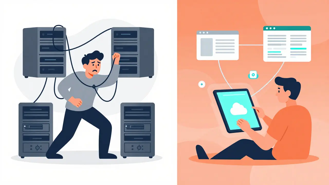
Speed isn’t free. Dr. James Peterson from Stanford’s Data Science Institute notes a paradox: while development time drops by 65-80%, maintenance costs rise by 22%. Why? Technical debt. When non-developers build complex logic, it often lacks structure. Six months later, no one remembers why a certain filter was added, making updates risky.
Dashboard proliferation is another real risk. Mark Chen, a Principal Analyst at Forrester, warns against creating governance vacuums. He cites cases where organizations ended up with 37 different sales dashboards because anyone could build one in an afternoon. Without central oversight, you lose a single source of truth.
- Solution: Establish a 'dashboard registry.' Even if analysts build their own tools, they must log the dashboard’s purpose and owner in a shared document.
- Solution: Use templates. Force new dashboards to start from a approved template to ensure consistent styling and data definitions.
Security and Compliance Considerations
If you work in finance or healthcare, vibe coding introduces new compliance questions. Deloitte’s 2025 survey shows 67% of financial firms require extra security reviews for vibe-coded dashboards. You aren’t just sharing data; you’re exposing API endpoints and potential injection points.
Check your tool’s security specs carefully. Anything offers encryption at rest and in transit, plus role-based access control (RBAC). Appy Pie’s lower-tier plans might lack these enterprise features. Always verify if the platform supports GDPR or HIPAA requirements relevant to your sector. Base44, leveraging Supabase, provides automatic authentication schemas which help secure APIs out of the box.

Future Outlook: Will Tableau Survive?
Gartner predicts that by 2027, 70% of departmental dashboards will originate from vibe coding tools. This doesn’t mean traditional BI tools like Tableau or Power BI will disappear. They will likely absorb these capabilities. We’re already seeing GitHub Copilot add 'dashboard-specific context awareness' to improve chart generation accuracy.
For now, the sweet spot for data analysts is hybrid usage. Use vibe coding for rapid prototyping and departmental self-service tools. Keep heavy-duty, board-level reporting in established BI platforms. The market is consolidating; expect standalone tools like Glide or Bubble to either get acquired by major vendors or carve out permanent niches in low-complexity, high-volume scenarios.
Frequently Asked Questions
Do I need to know SQL to use vibe coding tools?
No, most modern vibe coding tools abstract SQL away. You describe the logic in natural language (e.g., "show total sales per month"), and the AI generates the underlying query. However, understanding basic SQL concepts helps you troubleshoot when the AI misinterprets complex joins or aggregations.
Which tool is best for beginners?
Glide is widely considered the easiest entry point for data analysts. It connects directly to Google Sheets and requires minimal setup. Femaleswitch reports that users with basic spreadsheet skills can create simple dashboards in 2-4 hours. Bubble is powerful but has a steeper learning curve due to its visual programming model.
Can vibe-coded dashboards handle large datasets?
It depends on the tool. Bubble handles up to 10,000 records efficiently but may slow down significantly above 50,000 records. For massive datasets, tools that integrate with external warehouses (like Snowflake or BigQuery) via Cursor or specialized connectors are better suited. Always test performance with a sample of your largest dataset before deploying.
How do I prevent dashboard sprawl?
Implement governance early. Create a central registry of all dashboards built with vibe coding tools. Require a brief business case for each new dashboard. Encourage analysts to update existing dashboards rather than creating new ones for minor variations. Regular audits every quarter can help archive unused reports.
Are these tools secure for enterprise use?
Many are, but you must choose the right tier. Look for features like Single Sign-On (SSO), Role-Based Access Control (RBAC), and audit logs. Platforms like Anything and Base44 offer robust security controls suitable for regulated industries. Cheaper tiers may lack these features, so verify compliance needs (GDPR, HIPAA) before committing.